As the utilization of the mobile web increases, making sure websites are adapted for cell phones is increasingly critical. In this blog post, we’ll look at why having a mobile-friendly website is so important and how responsive web design can help you achieve that goal.
We’ll discuss why search engines like Google prioritize mobile-friendly sites in their search results and how this impacts your user experience.
To ensure an optimal user experience on smaller screen sizes, we’ll provide tips for making your existing website more mobile-friendly and highlighting the essential elements.
Additionally, we’ll delve into the differences between designing for desktop versus mobile platforms and how creating a separate mobile version or app may not always be the best solution.
Finally, we’ll demonstrate how to utilize Google’s Mobile-Friendly Test tool for assessing if your site is up to its standards.
If you’re looking to improve your website’s performance on mobile devices and attract more traffic from users searching on the go, then keep reading!

More Resources :
Having a Mobile Friendly Web Design
Having a mobile-friendly web design is becoming increasingly important in today’s digital world. With over 60% of internet traffic coming from mobile devices, businesses need to have websites that are optimized for these smaller screens.
When designing a website with mobile users in mind, there are several key features to consider. One of the most important aspects is ensuring that the site loads quickly and efficiently on all devices.
This means avoiding large images or videos that could slow down loading times and using compressed files whenever possible.
Additionally, having an intuitive navigation system can help make it easier for visitors to find what they’re looking for without getting lost or frustrated along the way.
Another crucial element of a successful mobile-friendly web design is making sure all content displays correctly on any device used by visitors. This includes everything from text size and font choice to buttons and links being easy to click on small screens.
It also means avoiding programs like Adobe Flash which won’t work properly on some phones or tablets – instead opting for HTML5 as an alternative solution where needed.
Finally, creating specific features designed specifically with mobile users in mind can be incredibly beneficial when trying to optimize your website’s user experience (UX).
For example, adding ‘click-to-call’ buttons makes it much easier for customers who want more information about your products or services while browsing your site from their phone – rather than having them manually type out numbers into their dialer app themselves!
Similarly, adding location tracking capabilities allows you to provide more relevant content based on where people are located – such as nearby stores or events taking place near them – thus increasing engagement levels even further!
Develop a Responsive Layout
Developing a responsive layout for your website is essential in today’s digital world. With more and more people accessing the internet from their mobile devices, it is important to make sure that your website looks great on all types of screens.
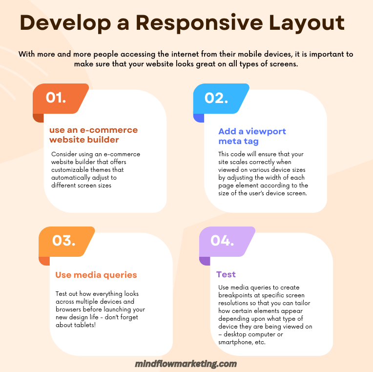
Here are some tips for creating a mobile-friendly, responsive design:
This code will ensure that your site scales correctly when viewed on various device sizes by adjusting the width of each page element according to the size of the user’s device screen.
For example; images may need resizing differently depending upon whether they are being viewed on a laptop or tablet and text might need increasing font size if it is too small when displayed on a phone browser window etc.
Make sure there aren’t any display issues with fonts or images not loading properly and check links work correctly too – nothing worse than clicking through only to find an error message waiting!
All these steps will help ensure visitors get an optimal experience no matter what kind of device they’re using – giving them one less reason not to buy from you!
Content Delivery Networks (CDNs) can help to improve website speed by providing multiple copies of content stored around the world. This means that when a user accesses a webpage, they will receive data from servers located close to them rather than those far away which could take longer due to the distance traveled over networks such as fiber optics cables. CDNs provide better performance overall and ensure speedy delivery regardless of where users are accessing the website from.
Optimize Website Speed
Website speed is an important factor for any business looking to make a good first impression on its visitors. A website that loads quickly can have a conversion rate three times higher than one that takes five seconds or more, according to Portent’s survey.
To check your website’s loading time, use BrowserStack SpeedLab and enter the URL of your site. This tool will give you scores for both desktop and mobile viewing so you can see how fast your site is performing in each environment.
One way to improve website speed is by hosting videos on third-party sites such as YouTube or Wistia instead of directly embedding them onto your page.
Doing this means that the weight of these videos won’t affect the overall performance of your website, allowing it to load faster.
Additionally, reducing file sizes wherever possible also helps with improving speed; compressing images before uploading them will reduce their size without sacrificing quality too much and ultimately help boost loading times across all devices.
Using caching techniques is another great way to optimize website speed – this involves storing static versions of webpages in memory so they don’t need to be generated every time someone visits the page again.
Caching makes pages load faster since there’s no need for extra requests from servers which would otherwise slow down loading speeds significantly.
It also reduces server strain since fewer resources are needed when serving cached content compared with generating new content from scratch each time a visitor arrives at a webpage.
Finally, using Content Delivery Networks (CDNs) helps deliver content quicker by having multiple copies stored around the world which are then served depending on where users access websites from – this means that if someone accesses a webpage from Europe they’ll get data sent from European servers rather than ones located far away which could take longer due to distance traveled over networks like fiber optics cables etcetera.
CDNs provide better performance overall and ensure speedy delivery regardless of location!
Switching from Adobe Flash to HTML5 is a sensible decision in terms of usability and SEO. It ensures that your website looks great on all devices, while still being optimized for maximum visibility online – something every web developer should prioritize.
Use Html5 Instead of Adobe Flash
Using HTML5 instead of Adobe Flash is becoming increasingly important for websites that want to provide a good mobile experience.
Unfortunately, Adobe Flash does not work on most mobile platforms, making it necessary to use an alternative technology such as HTML5.
HTML5 offers many advantages over Flash when creating content for mobile devices. It is supported by all major browsers and can be used without requiring any additional plugins or downloads.
Additionally, HTML5 provides better performance than Flash on both desktop and mobile devices due to its lightweight codebase and efficient rendering engine.
This makes it ideal for creating animations or interactive elements that need to run smoothly across multiple platforms.
Another benefit of using HTML5 instead of Adobe Flash is improved accessibility features.
Many users rely on assistive technologies such as screen readers to access digital content; however, these tools often struggle with complex flash-based applications or animations which can make them difficult or impossible to navigate through properly.
By contrast, HTML5 allows developers to create accessible content more easily thanks to built-in support for semantic markup tags like headings and lists which help describe the structure of a page clearly so they can be interpreted correctly by assistive technologies.
Finally, using HTML5 also helps improve search engine optimization (SEO).
Search engines have difficulty indexing pages created with flash because their algorithms cannot interpret the underlying code correctly; this means your website may not appear in relevant search results even if you have included keywords related to your topic within the text itself!
On the other hand, since search engines understand how HTML works they can recognize keywords contained within an HTML document much more easily – meaning you’ll get higher rankings in organic searches if you opt for html rather than flash when building your site!
Space Out Links
Spacing out links is an important part of creating a mobile-friendly web experience. When designing for mobile, it’s essential to make sure that the user can easily and accurately click on the link they want without having to zoom in or struggle with their thumb.
To do this, it’s best to space out your links so that users have enough room between them to avoid accidentally clicking on the wrong one.
It’s also important to limit the number of links you use when designing for mobile devices. Too many links can create a sea of blue which makes it difficult for users to find what they’re looking for quickly and easily.
Additionally, too many redirects from one page or site to another can be frustrating and lead people away from your website altogether.
If you must include a link that takes visitors offsite, make sure they know by clearly labeling it as such (e.g., “Click here to see Company XYZ’s new website”).
When spacing out your links, consider how much space each one needs depending on its size and complexity; larger buttons may need more room than smaller ones while complex navigation menus will require even more space around them so users don’t accidentally select something else instead of what they intended.
Additionally, think about where these elements are placed about other content; if there are multiple columns of text near each other then give extra padding between them so people won’t confuse one column with another when selecting a link within them.
Finally, pay attention not only to how far apart your links are but also to how close together – too much white space between two elements can be just as confusing as having none at all!
Compress Images
Compressing image is an important part of making sure that your website is optimized for mobile devices. Compressing images to reduce their size while preserving quality is a must for optimizing your website’s speed and performance across both desktop and mobile devices.
There are many tools available online that you can use to compress images such as TinyPNG or JPEGmini. It’s also important to choose the right image format when compressing; JPEG files tend to be smaller in file size than PNGs so they are better suited for websites with large amounts of imagery. Additionally, lazy loading can be used to only load content as it comes into view instead of all at once – this reduces page load times significantly on slower connections like those experienced by most mobile users.
Google’s Mobile-Friendly Test tool provides insight into how well a webpage works on different types of phones and tablets – including whether or not it uses compressed images properly – so make sure you run this test before launching any new pages or updates to existing sites. Optimizing content for mobile devices will also improve search results since more people now access the internet through their phones than through desktop computers.
Overall, compressing images is one way you can ensure that your website looks great across all screen sizes and loads quickly regardless of what device someone may be using; ultimately leading to a better user experience overall.
Compressing images can result in a smaller website, which leads to faster loading speeds and improved search engine rankings. By changing button sizes and placements on mobile devices, you can create a more user-friendly experience that will also improve SEO performance.
Change button size and placement
Having the right size and placement of buttons on a mobile website is essential for providing users with an optimal experience. Buttons should be large enough to hit with a thumb when scrolling, as most mobile device users use their thumbs for navigation. Buttons ought not to be too diminutive or situated in inconvenient locations on the page, as this can impede access.
Designing for mobile devices necessitates considering various display dimensions and orientations. You also need to consider how people will interact with your content – from tapping links and scrolling pages to swiping left or right through carousels and galleries. By ensuring that all interactive elements are easy to reach with a thumb swipe, you’ll create an enjoyable user experience across all platforms.
For more noticeable CTA buttons like “Buy Now” or “Sign Up”, make sure to use larger fonts, particularly on smaller screens. For maximum visibility, position your CTA buttons close to the bottom of each page so users don’t have to scroll too far up or down.
Avoid popups
Pop-ups, while a common feature on desktop websites, can be an unwelcome distraction for mobile users. On smaller screens, pop-ups are hard to view and often difficult to close out of because the X in the corner may not be visible.
Additionally, you cannot trigger pop-ups at certain moments such as when a user exits your site or hits the Contact Us section.
Popups can be a nuisance to users and should, whenever feasible, be avoided. Testing the website on different types of mobile devices periodically is critical for making sure your site looks and works correctly across all systems.
Test the website on mobile devices regularly

Testing your website on various mobile devices is critical for creating an optimal user experience. It’s important to ensure that the design and layout of your site look good across different screen sizes, platforms, and browsers. With more people accessing websites from their phones than ever before, it’s vital to make sure that you have optimized your website for mobile users.
It is essential to assess the responsiveness of a website across all popular operating systems such as iOS and Android, while also testing its performance in various web browsers like Chrome or Safari, and both portrait and landscape orientations. Verify the website’s compatibility with popular web browsers such as Chrome and Safari. In addition, make sure to assess the site’s performance when displayed in both portrait and landscape modes. Make sure that all images are properly sized so they don’t stretch out of proportion when viewed on smaller screens.
It’s also important to look at how quickly pages load on different devices as this can affect user engagement and satisfaction levels significantly. To do this, use tools like Google PageSpeed Insights or Pingdom Website Speed Test which will provide detailed reports about page loading times based on specific device types or networks used by visitors such as 3G/4G/LTE connections, etc. Compressing images is one way of improving page speed performance; another is reducing JavaScript code complexity if possible without compromising functionality.
Conclusion
To conclude, search-engine-friendly mobile design & development is an important aspect of modern web development. Careful planning and execution are essential to guarantee that your website is readily accessible from any device.
Crafting a great user experience on multiple platforms necessitates responsive web design, optimizing content for mobile devices, boosting site speed and performance, shrinking images plus altering button size and location.
Additionally, it’s important to test the website regularly on various mobile devices while avoiding popups or other distractions that may impact the usability of your website.
Take the time to ensure your website is search engine friendly by optimizing for mobile design and development. Let us help you make sure your site stands out from the competition with our expert solutions!