If you aim to refine your web page experience, then being aware of information architecture is critical. This blog post will explore good and bad information architecture and why it’s important for successful IA. We’ll also cover various tools to help you understand your site’s information architecture and categorize content effectively.
Furthermore, we’ll delve into how visual design plays a role in helping users understand the high-level overview of your site structure while keeping them engaged with finding important information easily. Lastly, we will touch on UX research methods that support building an excellent user experience through the effective content organization.

More Resources :
What is Information Architecture?
Information architecture (IA) is concerned with organizing, structuring, and labeling content in an efficient and long-term manner. The goal is to assist users in finding information and completing tasks. To do so, you must understand how the pieces fit together to form the larger picture and how items relate to one another within the system.
According to Peter Morville, the purpose of your IA is to help users understand where they are, what they’ve found, what’s nearby, and what to expect. As a result, your IA informs the content strategy by identifying word choices and user interface and interaction design by participating in the wireframing and prototyping processes.
Top information architecture mistakes to avoid
#1. Not Understanding the Website Audience
You might not get the desired applause if you sing jazz in front of a rock crowd. This is, in many ways, the cardinal sin that many website designers commit. They need to examine the data before them to understand the intended audience for their website.
Developing a strategy that provides visitors with a rich user experience will go a long way toward helping you connect with your website audience.

#2. Navigation Structure
The poor navigation structure is a common mistake in information architecture. It can be the difference between a website that’s easy to use and one that’s confusing and difficult to navigate.
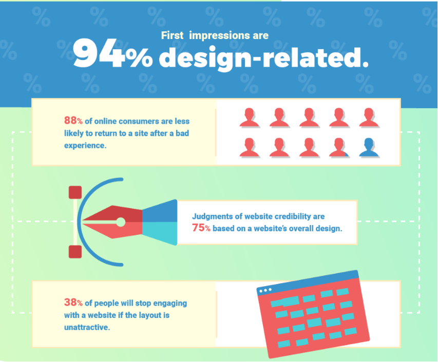
Poor navigation structure makes it hard for users to find what they need, which can lead to frustration and abandonment of the site altogether. First impressions of a website are 94% design-related
Common ways to avoid poor navigation
One way to avoid poor navigation structure is by creating an intuitive hierarchy. This means organizing content into categories that make sense from the user’s perspective rather than just throwing everything together in one big pile.
For example, if you have a blog about SEO, you could create separate sections for topics like keyword research, link building, technical optimization, etc., instead of having all your posts on one page.
Another important factor in avoiding poor navigation structure is ensuring each page has clear labels so visitors know where they are at any given time.
You should also ensure plenty of links throughout your site so people can easily jump from one page or section to another without getting lost or confused.
Try not to overload pages with too many options – this will only add clutter and confusion instead of helping users find what they need quickly and efficiently.
#3. Not Integrating Structure with Search
Many people engage in “search-dominant” behavior. This means they immediately go to the website’s search panel and search for whatever they seek. In many cases, they may need help finding what they are looking for due to a mismatch between the structure and search.
As a result, if you search for product A, you may be presented with many options and products other than product A. Alternatively, you may have to sift through several results to find your preferred product, A. Furthermore, search, and navigation need to support themselves on many sites.
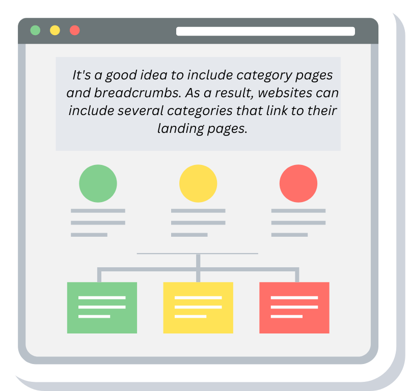
It’s a good idea to include category pages and breadcrumbs. As a result, websites can include several categories that link to their landing pages.
More Resources :
#4.Unclear Labelling
Unclear labeling is a common mistake in website information architecture. It can lead to confusion for users and ultimately cause them to abandon the site altogether.
Unclear labeling occurs when labels are used that need to describe what they link to accurately or if there are multiple labels with similar meanings but different destinations.
This can be especially confusing for first-time visitors who may still need to understand the site’s structure.
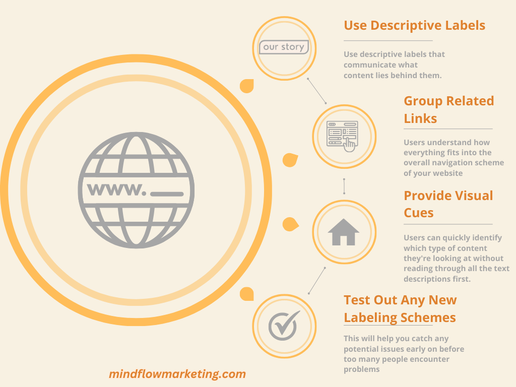
To avoid this problem, it’s important to use descriptive labels that communicate what content lies behind them.
For example, instead of using “About Us” as a label for a page about your company history, try something more specific like “Company History” or “Our Story” so users know exactly where they will end up after clicking on the link.
Additionally, it helps to group related links under one umbrella term, so users understand how everything fits into the overall navigation scheme of your website.
It’s also helpful to provide visual cues such as icons or images next to each label so users can quickly identify which type of content they’re looking at without reading through all the text descriptions first.
This allows them to get right down into the details without getting lost due to their unfamiliarity with your site structure and terminology.
You should test out any new labeling schemes before rolling them out on live sites by running usability tests with real people who represent your target audience and asking questions about their experience navigating around your website based on those labels alone – this will help you catch any potential issues early on before too many people encounter problems due unclear labeling later down the line!
#5. Poorly Integrating Sub-Sites and Micro-Sites with Main Site
Launching a microsite for your new product may sound appealing. Online marketing campaigns frequently necessitate sub-sites or micro-sites besides the main site. A dedicated microsite sounded like a good marketing idea during the marketing campaign launch.
However, now that the marketing campaign has passed, the microsite still litters the internet. Its sole purpose is to dilute the online presence of your main website and steal the spotlight instead.
The concept of microsites has faded and become obsolete. As a result, more information can be placed on a subsite within the main site, which must still be properly integrated with the main site.
#6. Lack of Search Functionality
Search functionality is essential to any website, and its absence can be a major information architecture mistake. With it, users can quickly find the content they’re looking for on your site.
This can lead to frustration and confusion as they need help navigating through pages of text or graphics in search of what they need.
A good search function should allow users to enter keywords or phrases that will return relevant results across the website.
It should also provide filters to narrow their searches by date range, category, author, etc.
If implemented correctly, this feature allows visitors to easily locate the specific information they require without trawling through endless web pages or menus.
It’s important not only that you have a search function but also that it works well; if results don’t appear accurately then people will only bother using it again and may give up on finding what they need from your site.
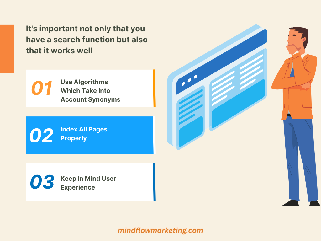
To ensure accuracy, use algorithms that consider synonyms and other related terms when searching for items; this way, you will get all the potential customers who might not know exactly how something is phrased but still want access to the same content.
Additionally, ensure all your pages are indexed properly so nothing gets left behind during searches – ‘out-of-sight means out-of-mind, after all!
Include clear instructions on how best to use it (e.g., “Enter one keyword at a time”) plus helpful hints such as spelling suggestions if words are spelled incorrectly. These small touches will go a long way towards making life easier for visitors who rely heavily on finding things quickly via search functions rather than manually navigating websites themselves!
More Resources :
#7. Overly Complex IA
One of the most common mistakes regarding website information architecture is having an overly complex IA. This can be a huge problem for users and search engine optimization (SEO).
When a website has too many levels or categories, it becomes difficult for users to quickly find what they’re looking for. It also makes it hard for search engines to crawl through all the pages and accurately index them in their databases.
One way to avoid this issue is simple categorization methods like flat navigation or single-level menus.
Flat navigation means that each page on your site should have no more than two clicks away from the homepage, while single-level menus are exactly what they sound like – there’s only one level of menu items available at any given time.
Both techniques make it easier for users to navigate your site without getting lost in a sea of options and subcategories.
Another important factor when designing an IA is making sure you use only a little jargon or technical language that could confuse people unfamiliar with the topic area you’re discussing.
Try using simple terms instead so everyone can understand what each page is about without guessing its meaning first.
For example, if you were talking about web hosting services on your site, rather than “server space rental,” call it “web hosting services.”
It’s also important not to overload visitors with too many choices immediately; this will lead them down a rabbit hole where they get overwhelmed and give up trying altogether!
Try limiting yourself to five main categories per page maximum – anything more than that will likely cause confusion rather than clarity when someone visits your site.
Remember that user experience (UX) also plays an important role here: If something looks cluttered or overwhelming visually, then chances are good people will only want to spend time exploring further into your content!
Make sure everything looks neat and organized so visitors know exactly where they need to go next without feeling lost along the way – this will help ensure better engagement rates overall, translating into higher SEO rankings over time as well!
More Resources :
#8. Ignoring Mobile Users
Ignoring mobile users is a website information architecture mistake that can have serious consequences.
With the increasing number of people using their phones and tablets to access websites, businesses must ensure they provide an optimal user experience on all devices.
You must do so to avoid losing out on potential customers and revenue.
One way to avoid this mistake is by making sure your website has a responsive design.
This means that the content will automatically adjust depending on the device being used, ensuring that users get the same experience regardless of what type of device they’re using.
It also helps with SEO since Google now considers how well a site performs on mobile when ranking its search engine results pages (SERPs).
Another important factor is page speed – if your website takes too long to load, visitors may become frustrated and leave before seeing any content.
Optimize images for different screen sizes to improve page speed and minify HTML, CSS, and JavaScript files where possible.
Make sure you test your site regularly across multiple devices and browsers to identify any issues or areas for improvement quickly.
Don’t forget about usability – make sure navigation menus are easy-to-use on smaller screens and buttons are large enough for fingers to tap accurately without accidentally clicking something else!
Also, consider reducing text size slightly, so it fits better onto smaller screens without having to scroll too much or zoom in and out constantly while reading through content.
By following these tips, you can help ensure that no matter what device someone uses when visiting your website, they will have an enjoyable experience from start to finish – after all, ‘the devil is in the details’!
More Resources :
FAQs About Information Architecture (Ia) Mistakes
Conclusion
Constructing a successful IA necessitates comprehending how individuals engage with your website. Unfortunately, many websites are plagued by common IA mistakes such as poor navigation structure, unclear labeling, lack of search functionality, and overly complex structures that can leave mobile users feeling lost.
By taking the necessary steps to ensure a user-friendly experience, you can prevent common IA mistakes and foster successful online engagement.
Take control of your website’s success and avoid costly IA mistakes. Improve user experience, search engine visibility, and site architecture with our expert guidance.