Creating interfaces for mobile devices necessitates a distinct strategy compared to designing for desktops. Mobile user experience (UX) design involves creating interfaces and interactions that work well on small screens with limited screen space.
In this ultimate guide to mobile UX design, we’ll explore the principles of good mobile design, including major navigation options and essential design elements.

More Resources :
What Is Mobile UX Design?
According to a TechCrunch article, mobile eCommerce accounted for nearly one-third of all online sales during the 2018 Thanksgiving holiday. Digital Trends reported in 2017 that 5 billion people worldwide now own a mobile device. Google also announced that mobile-first indexing is now used for more than half of the web pages in its search results.
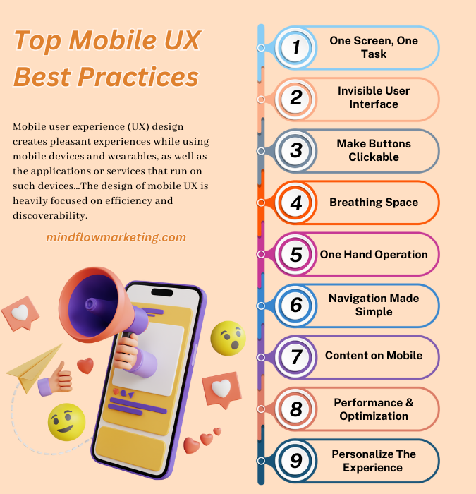
Mobile user experience (UX) design creates pleasant experiences while using mobile devices and wearables, as well as the applications or services that run on such devices…The design of mobile UX is heavily focused on efficiency and discoverability.
The Significance of Mobile Usability
In 2022, there will be approximately 6.6 billion smartphone users worldwide, with 76% of adults in developed countries (e.g., EU, US, Australia, South Korea, Japan) owning a smartphone. Because of this high market penetration, smartphones are driving increasing internet traffic. This implies that the volume of smartphone sales will rise as well. Many retail orders, for example, are now placed using mobile phones. Statista states mobile e-commerce sales in the United States will reach $431 billion in 2022.
To ensure your website meets this expectation, consider several key elements of mobile usability.
Responsive design ensures that your website looks great no matter what device or browser is used to access it. This means content will automatically adjust based on screen size and resolution so users can easily read the text without having to scroll horizontally or zoom inout constantly. Additionally, all buttons should be easy to click with a finger regardless of the user’s hand size or dexterity level.
Page loading speed is crucial for providing an enjoyable user experience; if pages take too long to load, visitors may become frustrated and leave before seeing what you offer them. Optimizing images and minimizing code bloat can significantly reduce page loading times while maintaining high-quality visuals.
Additionally, caching static files such as CSS stylesheets can increase page loading speeds by reducing server requests when someone visits your site from their mobile device.
Navigation menus should be designed with mobile users in mind; large drop-down menus are difficult for smaller screens, making tapping links nearly impossible without zooming in first (defeating the purpose of responsive design).
Instead, opt for simple navigation bars at the top or bottom of each page that allow quick access to any part of your website without having to pinch-zoom out to see all options available within a menu bar item like “Products” or “Services,” etcetera.
Touchscreens require larger target areas than mouse cursors do due to fingers blocking some parts of the display when trying to tap small targets accurately, so make sure buttons are big enough (around 44px); otherwise, users won’t be able to hit them correctly every time resulting in frustration as well as possible data loss since most forms require multiple inputs such as email address + password combinations etcetera.
It’s important not to overload pages with too much content since space is limited on smartphones compared to desktops computers – focus instead on highlighting key points while leaving out unnecessary information that would only serve to distract readers from the primary message you’re trying to convey, thus keeping them engaged longer rather than causing confusion leading early abandonment rates potentially damaging conversions down the line.
Top Mobile UX Best Practices

Mobile devices are becoming increasingly important in our digital world. Did you know mobile internet traffic makes up nearly 60% of total internet traffic? This figure is on the rise.
Here are the top mobile UX best practices.
#1. One Screen, One Task
It is a popular concept in UX design stating that each screen should be dedicated to one task. You should avoid cramming too much information into a single page or cluttering it with multiple calls to action.
Instead, focus on creating an interface where users can accomplish their goals quickly and easily.
By using this approach, you are making the user’s experience easier and more intuitive. It reduces the time required for them to learn how to use your product by providing clear instructions on what they need to do next.
It also simplifies navigation, as users will only have one option at any time instead of being overwhelmed with choices. Furthermore, it helps reduce cognitive load since there is less clutter and fewer distractions, which improves overall usability and engagement levels.
#2. Invisible User Interface
The invisible user interface (UI) concept is becoming increasingly popular in web design. It involves creating an intuitive, easy-to-use, discreet, and minimalistic UI.
This type of UI allows the user to focus on their task without worrying about navigating through multiple menus or buttons.
Instead of relying on labels and navigation bars, designers must find ways for users to complete tasks quickly and easily with as little effort as possible.
For example, rather than having a search bar at the top of every page that users have to click on before they can start typing their query, designers could create an icon that, when clicked, will automatically expand into a search box with the cursor already in it – this way users don’t need to take any extra steps before beginning their search.
Visual cues such as color changes or animations can make interactions more visible without taking up too much space on the screen. Animations can be used not only for feedback but also for guiding users toward completing certain tasks.
Suppose you want your user to do something specific. In that case, adding subtle animations like arrows pointing them in the right direction can be helpful without cluttering up your design with labels or other elements that would otherwise distract from the content.
#3. Make Buttons Clickable
Small touch controls are the banes of users’ lives. They are unable to save virtual screen space and, as a result, degrade the user experience.
Every operating system has different button design options for a better user experience. In many cases, buttons with 44px height and 44px width work flawlessly on every operating system and mobile device.
#4. Breathing Space
White space, also known as negative space or breathing room, is essential to mobile design. It’s not just a “waste of valuable screen estate” but improves readability and content prioritization while simplifying the visual layout.
White space helps create a balance between elements on the page and allows users to focus easily on what matters most. By increasing the distance between key components, users are more likely to take notice of important information without feeling overwhelmed by too much clutter.
Additionally, white space can be used to break up long passages of text into digestible chunks, making it easier for readers to scan through pages quickly.
With careful white space around headings and key elements, you can direct user attention toward those items before anything else. This makes it easier for them to find the information they need without having to search through a sea of words or images.
For example, if you have multiple sections on your website with different topics, such as product descriptions and customer reviews, using ample amounts of whitespace will allow each section to stand out from one another so that visitors know where exactly they should look for specific details about products or services offered by your business.
When designing websites with complex structures such as multi-level menus or hierarchies, white space can be used effectively here too. Adding padding around navigation links or separating categories within dropdown menus – helps guide users toward their desired destination while still keeping things organized and visually appealing at the same time.
Not only does white space help with usability and content prioritization, but it also has implications for SEO rankings.
Search engine algorithms consider how well-structured webpages are when indexing them. If there are plenty of empty spaces surrounding text blocks, then chances are higher that these pages will rank better than others who need to utilize this technique properly.
In addition to improving usability & SEO rankings -white spaces also play an important role in creating positive user experiences online.
Studies have shown that people tend to feel more comfortable browsing sites that have been designed with generous amounts of blank areas throughout since these environments appear less cluttered & overwhelming compared to ones filled with excessive visual and textual content all over the place.
#5. One Hand Operation
85% of observed users working with their phones using one hand.
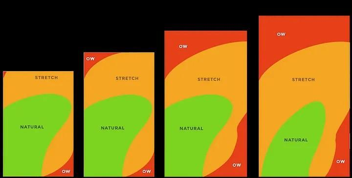
The thumb zone is a term used to describe the area of a device’s screen that can be reached by one hand while holding it. As phones become larger and larger, the reachable area for users becomes smaller and more difficult to access with just one hand.
This means designers must take into account how their app will look on large screens when creating user experiences.

To make sure your app or website can be easily used with one hand, designers need to consider what elements are placed within the easy reach of a user’s thumb. Navigation options such as menus and buttons must be placed where they can quickly be accessed without stretching too far across the display or using two hands.
Additionally, any text input fields should be located near the top of the page so they don’t require excessive scrolling or zooming to fill out forms quickly and accurately with just one finger.
Another way designers can help improve the usability on large devices is by hiding unnecessary elements when possible. If sections of content aren’t necessary for basic usage but still exist on desktop versions, these should either not appear at all or have hidden menus. Hence, they’re only accessible if needed.
This helps reduce clutter on small screens and makes it easier for users to focus on what’s most important without getting overwhelmed by too much information at once.
#6. Navigation Made Simple
When it comes to mobile navigation, the challenge is twofold – how to make it accessible while also taking up minimal screen space?
Many apps try to cram too much into a small area or have too many options that can be overwhelming for users. To create an effective mobile navigation experience, designers must prioritize the content over decorative elements and ensure that all major navigation options are discoverable and accessible with one tap.
Tab bars and navigation bars are great solutions for apps with relatively few navigational options because they display all major features in one place, allowing users to quickly move from page to page with just one tap.
They also take up very little screen space, so plenty of room is left for content without compromising user experience (UX). Additionally, tab bars can be customized easily by adding icons or labels depending on what works best for your app design.
While tab bars and navigation bars are great solutions when you only have a few nautical items, they may not work well if you need more than three or four sections within your app’s menu structure.
In this case, other types of menus, such as sidebars or hamburger menus, may be better suited since they provide more flexibility when organizing multiple sections within an app’s menu structure while still taking up minimal screen space.
Sidebars offer quick access to various pages through dropdown menus which can help reduce clutter on the main page. In contrast, hamburger menus allow users easy access via a single icon at the top right corner of their screens – making them ideal for larger apps with many sections that efficiently need organizing.
#7. Content on Mobile
Mobile content needs to be tailored for users’ convenience. This means only essential information should be presented to mobile users, and less important content can be requested. To make it easier for users to select the right information, structure it into individual units with in-page links so they can quickly access each.
Banner blindness is an issue when ads look like regular content on desktop and mobile devices. To prevent this from happening, use visual indicators such as different colors or icons, which are more likely to attract attention compared to plain text alone.
Additionally, offer advanced table manipulation techniques like hiding and reordering columns so people can find what they need faster without getting overwhelmed by too much data at once. Finally, redesigning pages according to usability guidelines is key – here’s an example of how it looks in practice.
#8. Performance & Optimization
Optimizing performance is critical to guaranteeing a positive experience for users when they access your site on their mobile devices. Slow loading times can cause frustration and lead users to abandon your site before they’ve even seen what you have to offer.
To maximize user experience, optimizing performance is essential; fortunately, there are a few techniques to ensure swift loading times on all devices.
This means compressing large images, minifying JavaScript files, and utilizing caching techniques such as browser or server-side caching with CDNs (Content Delivery Networks).
Additionally, use lazy loading where possible so that only the content needed for each page loads when it’s requested by the user instead of downloading everything at once.
Images should be compressed as much as possible without sacrificing quality too much – this will help reduce file sizes and improve page speed significantly. To ensure a great user experience, images should be scaled properly for various device sizes.
Consider using AMP (Accelerated Mobile Pages) technology when creating webpages for mobile devices; this helps deliver faster loading speeds across all platforms while still providing a great UX design.
It also allows you to create interactive elements such as carousels or slideshows which would normally require more code than usual due to their complexity but with AMP they become easier to implement without compromising speed or usability.
#9.Personalize The Experience
58% of smartphone users prefer brands that provide a mobile experience based on their profile information or previous interactions. To drive engagement and conversions, your mobile app UX should deliver targeted content and communications (e.g., via push notifications).
Conclusion
Adhering to the rules and recommended approaches of mobile UX can guarantee your website is optimized for both desktop and mobile platforms. Creating a favorable impression on visitors to your site and enhancing their overall involvement can be accomplished by crafting an effective user experience.
Implementing these principles into your design process will help ensure users enjoy navigating through the content on any device they choose to use. Mobile UX: Guidelines & Best Practices are essential in creating an engaging user experience across all platforms today.
Discover the best practices for optimizing your mobile website’s search engine visibility and user experience. Please take advantage of our expert advice to improve your web presence today!